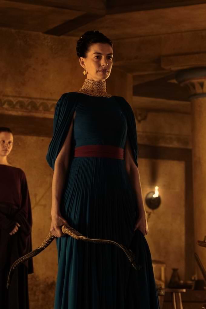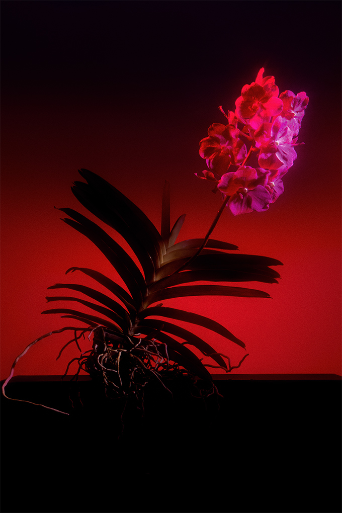
The heady lushness of the Vanda Vogue Orchid practically seeps off the page. It follows, then, that it couldn’t have been any collaborative agency other than Studio Oooze that we turned to when we wanted the ethereal, the bold, and the otherworldly. Sean Ashley and Dionna Lee, creative partners at Studio Oooze, are adept artists well-versed in reinterpretation. They’ve taken the idea of what it might mean to be “in bloom” and have run with it.
Ashley and Lee have been taken all over the world by their obsession with colour and texture. Their mutual background in design and engineering has lent them a knack for scene-setting and a finely honed creative instinct. Their versatility is evidenced in each new project to which they commit themselves wholeheartedly, whether it be to recontextualise the idea of coffee, jewellery, or a magazine. From sketches to still-life, their skill in styling—in manipulating the very universe surrounding to fit the theme of their subject—guarantees a visual challenge to the status quo.
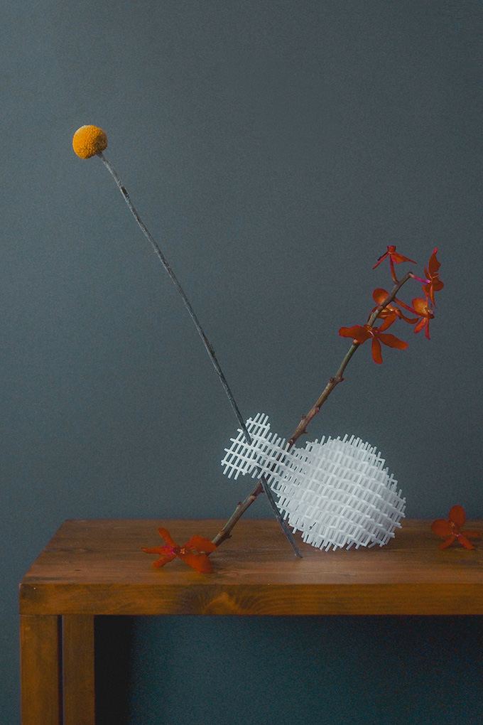
In particular, the dulcet sunset tones that play across ‘Triptych: State of Euphoria’ pierce and punctuate Studio Oooze’s photography. Certainly, it is Ashley and Lee’s mutual love of light and form that has mostly heavily influenced their project; the viewer is tantalised by it, drawn in by the mystery and story of the triad of photographs, meant to be viewed as one. The triptych, after all, historically was a panel painting sliced into three sections and displayed primarily as an aid to devotion. Certainly, with this valiant artistic undertaking, Studio Oooze has channelled that devotion immaculately.

What was your thought process when you started working on ‘Triptych: State of Euphoria’?
We wanted the visuals to exude femininity and create a sense of euphoria. We were inspired by triptychs that depicted time, tradition, and the adaptation of ideas. The representation of the triptych of orchids is a time capsule that allows us to gaze at the colours and to walk through the scenes, bringing you to a convergence of otherworldliness and sensuality.
What signature elements have you incorporated into the artwork for Vogue?
We embraced the interaction of textures, light, and colours whilst photographing the Vanda Vogue Orchid. This organically created a rhythm of nostalgia.
How would you describe your artwork for Vogue Singapore in three words?
Traditional. Provocative. Feminine.
What is one skill or habit that you have picked up during the pandemic?
We’ve learned to take a breather and really just slow down. This period has allowed us to be more introspective. It’s been a great lesson to pace ourselves.
What is one thing that you are thankful for, even in the midst of this global pandemic?
That we are all healthy and we are able to continue doing what we love for a living—craft creative projects.
As the world opens up, what is one thing that you are most looking forward to?
We think travel is on everyone’s minds. We can’t wait to escape and find new inspirations when we are able to revisit our favourite places in the world once more.
Do you think art and creativity is essential today?
Yes, we see art and creativity as calming and eye-opening sources of energy that awaken the senses. Good design is essential to everyday life; imagine road signs in Comic Sans typeface instead of legible typefaces like Helvetica. What if traffic lights weren’t red, amber, and green? Colour is innately laden with significance to the everyday person. It’s intuitive and instinctive.