According to Studio Nari’s founder Caterina Bianchini, the power of a typeface goes beyond its ability to communicate words. “It should evoke a sense of feeling. As human beings, we subconsciously connect with typefaces on a far higher level than we understand.”
When she received the brief to create a bespoke typeface for Vogue Singapore that challenged the conventional rules of typography, she was justifiably excited. “My first thoughts were—wow, it’s Vogue! Vogue is an institution we have admired for a very long time. And then I thought, let’s see how far we can push this.”
Bianchini’s rule-breaking approach to typography was precisely what Vogue Singapore’s art director Henry Lloyd had wanted to tap into. “For Vogue Singapore’s signature typeface, I wanted something that ignored legibility and focused on form, shape and beauty. Caterina’s style is artful and avant garde, so I knew she’d be the right fit for the project.”

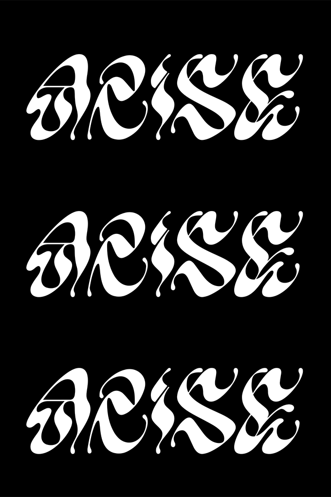
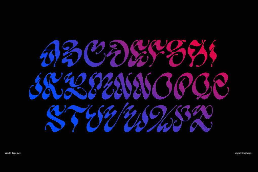
Created over the span of four months, the final typeface is shaped by a myriad of unique influences and unlike anything ever seen before. Singapore’s national flower—the Vanda Miss Joaquim orchid—was referenced through small twists within the typeface, while the ancient script of Sanskrit inspired its undulating nature, rendering each character of the Vogue Singapore typeface complex and indecipherable at first glance.
The spiralling typeface can be found woven through the pages of Vogue Singapore’s first issue—used on the covers, section openers and within stories. It can also be seen interlinked with the magazine’s imagery, the twists of the characters winding through and around jewellery or lipsticks.

According to Lloyd, this is merely the first glimpse of the typeface’s limitless potential. “I keep finding new things in it. I’m excited to see how it evolves over time as we let it grow with the magazine.” Bianchini echoes his sentiment. “We want the typeface to be subjective and open to interpretation—and for readers to continue discovering it, issue by issue.”
Read on to learn more about the birth of the Vogue Singapore typeface, from the details of Bianchini’s intricate design process to how different influences shaped its creation.
What sets typography apart from other types of design?
Typography is an art of its own. It’s a very detailed process and can take years to master. At Studio Nari, we don’t call ourselves typographers, because our work is very artistic and playful. We create what is perhaps on the edge of what may be classified as a typeface. I actually call our creations art-faces instead of typefaces. We enjoy pushing the boundaries of the core elements of each letter, so the end product ultimately tests the viewpoint of those who come into contact with it.
What did the brief for your collaboration with Vogue Singapore look like?
We received a fairly loose brief from Henry. We were tasked with creating a title font connected to the identity of the new Vogue Singapore, which could be used across digital and print. The font had to feel unique, bold and connected to Singapore as a city.
Please walk us through the stages of the design process that followed.
All our work is very deeply rooted in concept, and that’s where our design process starts. For this particular project, we had an overarching concept—“Strange is Beautiful”—which filtered down into the design of the typeface. We wanted to create a typeface that challenged people’s perception of editorial design.
We then conceptualised three key creative touchpoints that would go into the typeface. The first was the Vanda Miss Joaquim orchid, the national flower of Singapore. We built this into the typeface by creating small twists in every character, referencing the twisted petals trademark of the Miss Joaquim species of orchid. The second touchpoint was the Singapore Stone, which is an important relic from Singapore’s earliest history. We were inspired by the Sanskrit script found on the stone, and used the shapes of its accents to influence the shapes we built within our letters. The final touchpoint was what we describe as a sense of strangeness. We created this by contrasting line weights—very thin lines sitting next to very thick, creating a point of interest.
Finally, we began the font build. We worked in collaboration with typographer Margot Leveque, who began with calligraphy sketches on pen and paper. From these sketches, we had many rounds of discussion and worked with the Vogue Singapore team to come up with the final design.
The sketches were then vectorised into a digital format. Having the typeface begin as a sketch on pen and paper was very beautiful. We were able to see it existing in its physical form, before bringing it into the digital realm.

How do you think this typeface uniquely represents Vogue Singapore?
This font captures both the energy and history of Singapore city, and also the elegance of Vogue as an iconic publication. It also represents Vogue Singapore perfectly, with a sense of celebration, attitude, and unity. Ultimately, the font captures a particular kind of unusualness found so rarely in the world—except for in Singapore, a city which is a collection of different cultures.
What have you taken away from this project?
We have learnt a lot about Singaporean culture, its history and its people. There’s so much lust for life in Singapore, and the whole city has a heartbeat—we hope that one day we can visit and feel it for ourselves.
In terms of our craft, I have learnt to push our concepts even further. We really challenged ourselves for this project, presenting ideas that were so ambitious we thought they could never be accepted—but they were! This typeface has created a shift in what a commercial typeface is expected to be. We hope that what we have created together will become a piece of Vogue Singapore’s visual history.