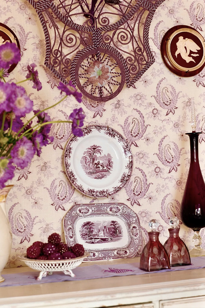
Mauve, a soft purple that sits somewhere between pink and violet, isn’t the most obvious of home decor colours. In fact, when looking at Benjamin Moore’s most popular paints of 2022, it’s not even listed in the top 75. (The three top spots go to grey, white, and beige.)
Part of the reason mauve flies under the radar is due to its position on the colour spectrum: those aforementioned, more neutral shades, after all, match pretty much everything and work in both residential as well as commercial settings. Part of it is also due to its long-time associations with a more romantic or feminine style. While that’s far from a bad thing, it can be limiting: many assume mauve works best as an accent, or possibly even on a wall of a teen girl’s bedroom.

However, in 2023, mauve is undergoing a rebrand as a romantic neutral that works in every and any room. In Vogue’s annual interior trends report, multiple designers cited the romantic earth tone as the “it” colour for the upcoming year. “Mauve is a rich colour that can swing both traditional and modern, and it feels fresh,” interior designer Heidi Caillier tells Vogue. “It is one of those colours that I feel works with just about anything.” Recently, Caillier adorned an East Hampton primary bedroom—including the ceilings—entirely in the shade, before using it extensively for a home on Washington State’s Fox Island.
Over in Los Angeles, Kathryn M. Ireland is also readily embracing mauve wallpaper and upholstery. “It’s a colour that is overlooked and unused,” she says. Meanwhile, Jake Arnold—founder of The Expert—just finished a mauve library in Beverly Hills. “It made the smaller space feel cosy,” he says. “We further accentuated the statement walls by incorporating a velvet quartzite coffee table and settee with Liberty of London fabric that included complementary faded purple accents.” (Arnold also featured the colour in his recent rug collection with Lulu & Georgia.)

So just why, exactly, is mauve having a moment? Experts point to a few reasons. Thanks to their associations with calmness and warmth, earth tones (particularly brown) saw a major spike during the pandemic—and, well, still are. It turns out that when the world outside is stressful, it’s nice to be brought back down to solid ground in our homes.
Still, some find several shades on the spectrum a bit too boring. (There’s a reason “beige” is also a synonym for bland.) Mauve, however, provides the best of both worlds: its muddy and dusty undertones evoke earthy tranquillity, yet it still has enough pigment to make it gently pop. “People are wanting to add more impact to their spaces, and mauve feels unexpected yet approachable,” Arnold says. “It’s a muted version of a purple or pink and has a warmth to it that feels very neutral.” On this, Ireland agrees: “For me, it’s a good neutral—a splash of it enhances any room.”

Clients also like that it’s not oversaturated, in both senses of the word: Whereas millennial pink now evokes an almost instant eye-roll, mauve’s deeper tones feel timeless. Ireland points out the colour’s perennial presence in the Scottish Highlands, where beautiful heather-covered hills bloom every August. “It’s not a flashy colour that people will easily tire of,” Arnold says. “It brings out a playfulness in the space that feels fresh and contemporary.”
Looking for ways to work mauve into your own space? Benjamin Moore’s Lost Locket (a favourite of Caillier’s), Farrow & Ball’s Sulking Room Pink, or Backdrop’s Jawbreaker are all modish options, while Schumacher’s Haruki Sisal or Edo Wisteria wallpaper will also do the trick. No matter what you pick, however, know that it will be a classic home decor choice. “Mauve has never gone out,” Ireland says.
This article was originally published on Vogue.com.


